
The overview in IELTS Writing Task 1: how to find the main features of a graph
The overview is two sentences, 40–50 words, and it affects your Task 1 score more than anything else. Without a separate paragraph giving the big picture, the first criterion, Task Achievement, rarely goes above 5 or 6, however well the figures are described. It is hard to write not because of the English, but because you first have to decide what the main features actually are. Below is a routine for finding them: which questions to ask the graph, which answers go into the overview and which stay for the body. We work through a real task from our trainer. The general mechanics of Task 1 are covered in IELTS Writing Task 1: how to describe graphs, tables, processes and maps.
What an overview is, and what it is not
The overview answers the question: if you had one sentence, what would you say about this picture? It is not a tour of every line in turn, but two or three main observations you could see from two metres away.
- Where: as the second paragraph, straight after the introduction, so the examiner sees it at once. Putting it at the end is allowed, but then it is easy to run out of time or turn it into an "In conclusion" that repeats the figures.
- How long: two sentences, occasionally three. About 40–50 words.
- No numbers. No percentages, no "doubled", no "fivefold". A multiple is a number too; it belongs in the body.
- No reasons or opinions. "Because of new technology" is a mistake in any Task 1 paragraph, and especially visible in the overview.
- Not about the layout. "The graph has four lines and the x-axis shows years" is not data. It describes the frame and earns nothing.
A test that always works: remove every number from the sentence. If it still says something true about the data, it is an overview. If it becomes empty or meaningless, it is body detail.
Six questions to ask the picture
The first two or three of your twenty minutes go on looking at the picture without writing. Ask it six questions in order. The answers are your fact list, and both the overview and the body grow out of it.
- Overall direction. Does everything rise, everything fall, or do some rise while others fall? Compare only the start and end of the period; ignore the middle for now.
- Highest and lowest. Which category is the largest and which the smallest? At the start, at the end and across the whole period. The single highest point on the graph is almost always worth mentioning.
- Biggest change. Which line travelled furthest, up or down? Judge by the difference between start and end, not by how steep the line looks: the slope depends on the axis scale.
- Peaks and troughs. Is there a line that rose and then fell, or the other way round? A turning point is a separate observation; it cannot be reduced to "rose" or "fell".
- Change of leader. Do the lines cross? If the category that started first ended up behind, that is almost certainly the headline of the graph.
- Groups. Which categories behave alike? Two lines that both rose and two that both rose and then fell already make two groups. The groups will later become your two body paragraphs.
Not every question will have an answer: a chart for a single year has no trends, and a table may have no crossings. That is fine. The overview needs the two or three biggest observations, not all six.
A worked example
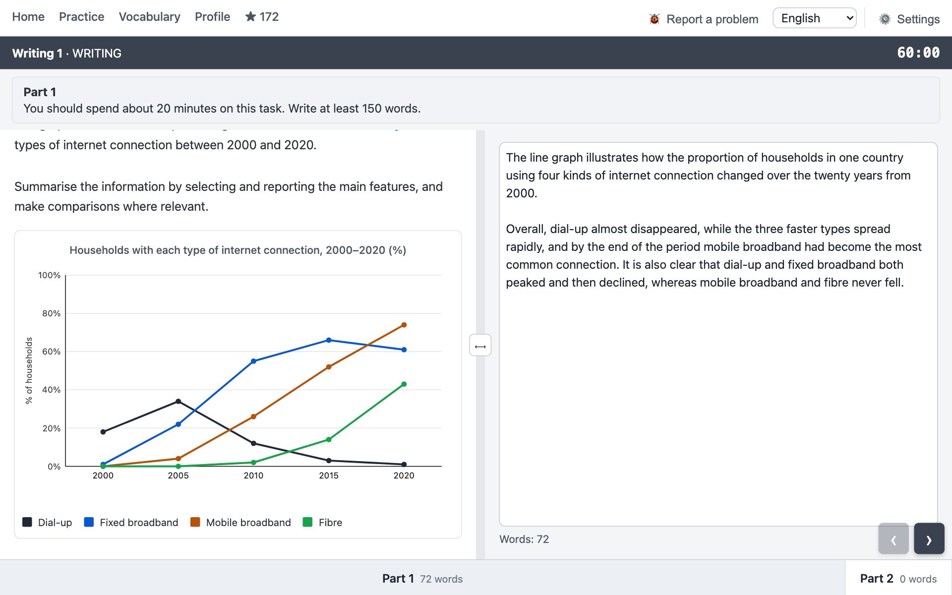
The task in the screenshot above: the percentage of households in one country with four types of internet connection between 2000 and 2020. The figures by year:
| Type | 2000 | 2005 | 2010 | 2015 | 2020 |
|---|---|---|---|---|---|
| Dial-up | 18% | 34% | 12% | 3% | 1% |
| Fixed broadband | 1% | 22% | 55% | 66% | 61% |
| Mobile broadband | 0% | 4% | 26% | 52% | 74% |
| Fibre | 0% | 0% | 2% | 14% | 43% |
Run the six questions and note the answers briefly, as you would on scrap paper in the exam:
- Direction: three types rose; dial-up fell almost to zero.
- Highest and lowest: the highest point on the graph is mobile broadband in 2020. The lowest at the end is dial-up. At the start, dial-up was in the lead.
- Biggest change: mobile broadband, from nothing to three quarters of households.
- Peaks: dial-up peaked in 2005 and then collapsed. Fixed broadband peaked in 2015 and dipped slightly.
- Change of leader: first fixed broadband overtook dial-up, then mobile broadband overtook fixed. The leader changed twice.
- Groups: "peak and decline": dial-up and fixed broadband; "growth only": mobile broadband and fibre.
Now select. The overview takes what describes the picture as a whole: dial-up disappearing while the rest grew (question 1), the new leader at the end (questions 2 and 5) and the split into two groups (question 6). Everything else — the year of each peak, the exact percentages, when the lines crossed, "from zero to 74%" — is detail for the body.
Overall, dial-up almost disappeared, while the three faster types spread rapidly, and by the end of the period mobile broadband had become the most common connection. It is also clear that dial-up and fixed broadband both peaked and then declined, whereas mobile broadband and fibre never fell.
It passes the no-numbers test: there is not a single figure, yet every claim is true and can be checked against the graph. The first sentence gives the overall direction plus the leader at the end. The second gives the grouping, which also sets up the body: the first paragraph covers the two lines that peaked, the second the two that kept rising.
The full answer
Here is how the overview fits into a band-7 answer of about 170 words. Notice that the body does not repeat the overview; it backs it up with figures.
The line graph illustrates how the proportion of households in one country using four kinds of internet connection changed over the twenty years from 2000.
Overall, dial-up almost disappeared, while the three faster types spread rapidly, and by the end of the period mobile broadband had become the most common connection. It is also clear that dial-up and fixed broadband both peaked and then declined, whereas mobile broadband and fibre never fell.
Dial-up was the most widespread connection at first, rising from 18% to a peak of 34% in 2005. It then collapsed, and by 2020 only 1% of households still used it. Fixed broadband grew far more steeply, overtaking dial-up in the mid-2000s and reaching a high of 66% in 2015, before slipping to 61%.
Mobile broadband, by contrast, climbed throughout the period, from almost zero to 74%, and overtook fixed broadband in the final five years. Fibre was the last to appear: it remained negligible until 2010, but its growth then accelerated, reaching 43% by the end of the period.
Words for the main features without numbers
You cannot say "74%" in the overview, so you need words that convey size and position without figures. There are not many of them, and they repeat from graph to graph.
| What to say | How |
|---|---|
| Highest | X was the most common / popular / widespread; X accounted for the largest share; X had the highest figure throughout |
| Lowest | X was the least common; X remained the smallest category; X played only a minor role |
| Overall direction | rose / fell over the period; the overall trend was upward; all categories except X increased |
| Peak and decline | X peaked and then declined; X rose at first before falling back |
| Change of leader | X overtook Y; X replaced Y as the most common; by the end of the period the ranking had reversed |
| Biggest change | X saw the most dramatic change / the steepest rise / by far the largest increase |
| Stability | X remained relatively stable; X changed little over the period |
| Groups | A and B followed a similar pattern, whereas C and D…; the two largest categories…, while the others… |
Words such as almost, nearly, far, by far, most are fine in the overview: they are judgements, not figures. Years are not forbidden either, but it is better to do without them: at the beginning of the period, by the end of the period, throughout.
Frames for the first sentence, one for each typical picture, are collected in the overview section of IELTS Writing Task 1: how to describe graphs, tables, processes and maps. The second sentence can start with It is also clear that… and cover the grouping, the biggest change or the change of leader — whichever of the six answers did not make it into the first.
The overview for other types of picture
The six questions work for any chart with numbers; only which of them matter most changes.
- Bar chart for two years. The key points are which categories rose, which fell, and whether the order changed. Overall, walking and cycling lost ground to the car, which became the most common way of getting to school.
- Bar chart with no time. No trends, but there is a leader, a laggard and groups. Overall, the youngest group was the most active in every category, while participation fell steadily with age.
- Pie charts. Which share is largest and whether it swapped places with another. Overall, housing replaced food as the largest item of spending, while the remaining categories changed only slightly.
- Table. There are many figures and the eye drowns in them. First find the highest and lowest in each column, then see whether the same thing repeats. The overview is whatever repeats.
- Process. How many stages, where it begins and ends, whether it splits into phases. Overall, the process consists of eight stages, beginning with the collection of used bottles and ending with the production of new ones.
- Map. What the place turned into as a whole, and where most of the change happened. Overall, the area changed from farmland into a residential district, with most of the new building in the north.
Common mistakes
- Numbers in the overview. The most frequent mistake. "Overall, mobile broadband rose to 74%" is a body sentence in the wrong place. The examiner sees that there is no big picture.
- Describing the frame instead of the data. "The graph shows four types of connection over twenty years" is an introduction, not an overview. The second paragraph has to say what happened to those types.
- Listing one by one. "Dial-up fell. Fixed broadband rose. Mobile broadband rose. Fibre rose." Four facts and no generalisation. An overview groups them: "the three faster types spread".
- A factual error in the most visible place. "Mobile and fixed broadband rose equally" when one line turned down at the end. Or "more than doubled" when 6 became 11. The overview is read first, and a mistake there costs more than one in the body. Check every word against the picture.
- Missing the main feature. Writing about three rising lines and not noticing that the leader changed. That is why the change of leader has its own question.
- Reasons. "…because mobile internet became cheaper". Perhaps, but it is not in the picture.
- The same text twice. A sentence from the overview repeated word for word in the body. In the body the same observation should come with figures and a comparison.
- Punctuation at the join. Two observations joined with a semicolon, or "however" in the middle of a sentence. It is simpler to write two sentences, or one with whereas / while — and whereas never starts a sentence.
How to practise
The overview can be practised separately from everything else, and quickly. Take a graph and set a five-minute timer: three minutes for the six questions, two for the two sentences. Then check yourself: no numbers, every claim true, no missed change of leader or peak. Ten such rounds in a week do more than three full answers.
Tilmashq has all seven Task 1 types with an exam-style screen: the picture on the left, the answer box with a word counter on the right. After you answer, you get a band for each of the four criteria, a comment with quotes and corrections, and a version of your text rewritten to the target band. The grading is done by AI and is on average stricter than an examiner, so read the band as "at least". The tasks are our own, not taken from the exam.
Read next
- IELTS Academic: how the exam works and what to read for each section
- IELTS Writing Task 1: how to describe graphs, tables, processes and maps
- IELTS Writing: format, criteria, timing and how to prepare
- IELTS Writing Task 2: how to write an essay for band 7
- Why IELTS preparation needs practice tests, not just textbooks
Updated: 2026-09-18