IELTS Writing Task 1: how to describe graphs, tables, processes and maps
Task 1 worries people with the question “what is there to write about?”. The answer: nothing except what is drawn. No causes, opinions or conclusions, only what is shown, what the overall picture is and which figures confirm it. Below is the whole mechanism: task types, answer structure, a 20-minute plan, verb tenses, sentence patterns, vocabulary and a band 7 sample. The overall format of the section and the criteria are covered in IELTS Writing: format, criteria, timing and how to prepare.
What is expected of you
The task is always worded the same way: one or two sentences about what the picture shows, and a request to summarise the information by selecting and reporting the main features and, where relevant, making comparisons. You have 20 minutes and a minimum of 150 words, and the task is worth a third of the Writing band.
The examiner checks three things. First, whether you saw the overall picture, that is, the main trend or the main difference. Second, whether you supported it with specific figures from the picture. Third, whether you compared the data rather than describing each line separately. Everything else, including fine vocabulary, is secondary.
What is definitely not expected: explanations of why it happened, your opinion of the data, conclusions and recommendations. “Probably because of the economic crisis” in Task 1 is a mistake that costs marks on the first criterion.
Seven task types
| Type | What to look for | Key grammar |
|---|---|---|
| Line graph | Change over time: the overall trend, peaks and dips, where lines cross, where growth sped up or slowed down | Past Simple, verbs of movement |
| Bar chart | Comparison of categories, sometimes across different years: the largest and smallest, contrasts, what swapped places | Comparative structures |
| Pie chart | Shares of a whole: which dominates, how the shares changed between two years | Fractions and shares: a quarter, a third, accounted for |
| Table | The same data without a picture: pick 5–7 key numbers, the extremes and totals, do not copy everything | As for a graph |
| Two pictures at once | For example a pie and a line about the same thing: a paragraph for each and a linking sentence between them | According to the picture types |
| Process diagram | Stages from start to finish: how many there are, where it begins and ends, whether it splits into two phases | Present Simple passive, sequence of steps |
| Map | Two plans of the same place: what appeared, disappeared, moved, and in which direction | Passive in the past or future, words for location |
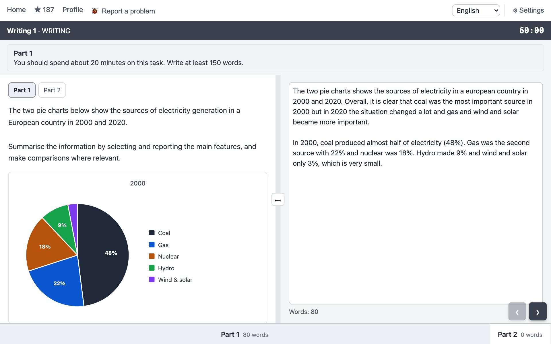
Answer structure: four paragraphs
| Paragraph | Sentences | Words | Rule |
|---|---|---|---|
| Introduction | 1 | ~25 | The task in your own words: what is shown, where and over what period. No “this report summarises”. |
| Overview | 2–3 | ~40 | The main trend and how the data groups. No figures. |
| Body 1 | 3–4 | ~55 | The first group of data, every statement with a number. |
| Body 2 | 3–4 | ~55 | The second group of data, also with numbers and a comparison with the first. |
Task 1 needs no conclusion: you have already given the overall picture in the second paragraph, and repeating it at the end adds words but no marks. The word count comes from facts, not from introductory phrases. If you end up under 150, you have missed data, not “written too little”.
The overview matters most
It is the presence of a separate paragraph with the overall picture that separates a 6 from a 7 on the first criterion. The test is simple: remove every number from the sentence. If it still says something true about the data, it is an overview. If it has become empty, it is a detail for the body.
Ready-made overview frames for typical pictures:
- Two opposite groups: Overall, A and B declined steeply, whereas C, D and E increased.
- One direction, different speeds: Overall, every category rose over the period, though X did so far more steeply than Y.
- Dominance: Overall, X was the most common category throughout the period, followed by Y.
- Change of leader: Overall, group A lost ground to group B, which overtook it during the period.
- A general turning point: Overall, the figures rose until 2010, after which the trend reversed for most categories.
- Process: Overall, the process consists of six main stages, beginning with the collection of raw material and ending with packaging.
- Map: Overall, the village changed from a farming settlement into a residential area, with most of the development taking place in the east.
The second sentence of the overview is usually about the biggest change or the ranking: It is also clear that X saw the largest change, and that by 2020 the ranking had reversed. Multiples (doubled, tripled) do not belong in the overview: they are numbers too, so keep them for the body.
A body paragraph is a group, not a list
A body paragraph is not a run through the categories one by one but a single group of data, opened by a topic sentence and held together by comparisons. A four-sentence frame:
- The topic sentence names the group without numbers: Turning to the mobile devices, all three categories rose over the period.
- The largest member of the group, with figures: Smartphone ownership rose dramatically, from 5% to 96%.
- The second member, tied to the first: Laptops followed a similar pattern, though from a considerably lower base.
- A closing comparison: Even at its lowest point, laptop ownership remained well above tablet ownership.
Glue between sentences, one per sentence: X, by contrast, moved in the opposite direction / Y followed a similar pattern, though from a lower base / The same was true of Z, which… / …, whereas Y fell. The word whereas does not go at the start of a sentence.
Timing: 20 minutes
- 0–3 min. Read and note down. Find the extreme values and the overall trend. Make a list of facts and split it into two groups: “rose” and “fell”, “large” and “small”, “before” and “after”. For example, for a graph with five countries: A 40→95, almost saturated; B 30→90, the same but slower; C 5→70, the steepest rise; D 2→25, lagging.
- 3–15 min. Write down the list from top to bottom. One line of the list is one sentence. Do not go back and do not rewrite.
- 15–18 min. Check against the picture. No figures in the overview? Every category mentioned? Every number matches the graph? Every “doubled” really doubled? This is where the most expensive mistakes are caught: the wrong year, the wrong line, “almost double” instead of “more than double”.
- 18–20 min. Tidy up. Typos, articles, percentages and percentage points, repeated verbs.
Any spare minutes go to Task 2, not to adding more to the chart. It is the essay that carries two thirds of the band.
The tense is chosen by the dates in the task
| Situation | Tense | Example |
|---|---|---|
| Describing the picture itself | Present Simple | The chart shows / compares… |
| Years in the past (most tasks) | Past Simple | Coverage rose from 3% to 61%. |
| No dates | Present Simple | Housing accounts for 30% of spending. |
| Years in the future | will / is expected to / is projected to | By 2030 the figure is projected to reach 90%. |
| “By a certain year” | Past Perfect | By 2020, the share had risen to 98%. |
| Process | Present Simple, passive | The wood is cut, dried and transported. |
| Map: before and after | Past Simple, passive | The factory was demolished. |
| Map: now and planned | will be / is to be | A car park will be built. |
Before every verb, ask “which year does this refer to?”. If there is an answer, use Past Simple. Present Perfect (has grown) is almost always a mistake in Task 1: there is no “now”, only dates. Continuous (was growing) is not needed either: the data are points, not a process.
Four sentence patterns
Almost every sentence about a trend is built on one of four patterns. Learn the slots, not the words: the vocabulary from the table below drops into them mechanically.
- Verb + adverb. Sales rose sharply from 20 to 35 million. The main pattern, roughly two thirds of your sentences.
- There was a + adjective + noun. There was a sharp rise in sales, from 20 to 35 million. For variety, no more than once per paragraph.
- X saw / experienced + noun. Sales saw a steady decline over the period, dropping from 35 to 20 million. The subject stays as the topic, good for the first sentence of a paragraph.
- A participle tail. Sales fell steadily, reaching 12 million by 2020. The cheapest way to add a figure without a new sentence: , reaching / dropping to / rising to / peaking at / leaving X at…
The pairing rule: if you know the adverb, you know the adjective. sharply — a sharp, steadily — a steady, gradually — a gradual, slightly — a slight, dramatically — a dramatic.
A strong sentence stacks three layers: the movement, the shape of the line and a comparison with the others. Smartphone ownership rose dramatically, from 5% to 96%, with growth accelerating after 2013 — by far the steepest increase of the five devices. One sentence, three facts, 22 words. Three of these per body paragraph and the word count takes care of itself.
Steepness: do not mix the levels
| How strongly | Rise | Fall | Adverb / adjective |
|---|---|---|---|
| Very sharply (several times over) | surged, soared, rocketed | plummeted, plunged, collapsed | dramatically / a dramatic |
| Noticeably (by half or more) | rose, increased, climbed | fell, dropped, declined | sharply, considerably / a sharp |
| Gently (by 10–20%) | rose, edged up, crept up | fell, edged down, slipped | steadily, gradually, slightly |
| Hardly at all | remained stable, levelled off, plateaued, hovered around, held steady | broadly, roughly | |
The angle of a line in the picture depends on the scale of the axis, so steepness is judged by the size of the change relative to the starting point and by comparison with the neighbouring lines. Soared for a 10% rise sounds absurd, but for a threefold rise it is exact. The shape of the line is named separately: growth accelerated after 2010 / the rise began to flatten out / after a slow start, X rose rapidly before levelling off / fluctuated between A and B. Crossings: X overtook Y in 2015 / the gap between X and Y widened / the two figures converged.
Vocabulary by function
| Function | Words |
|---|---|
| Introduction | shows, illustrates, compares, gives information about |
| Rise | rose, increased, grew, climbed; peaked at, reached a high of |
| Fall | fell, dropped, declined, decreased; hit a low of, bottomed out at |
| No change and fluctuation | remained stable / steady / constant, levelled off, plateaued, fluctuated between, hovered around |
| Multiples | doubled / halved, tripled / fell to a third, more than doubled, almost twentyfold, rose by 20 percentage points |
| Comparison | twice as high as, double the figure for, 20 points higher than, considerably / slightly more than, whereas, by contrast, followed a similar pattern, from a lower base |
| Shares | a quarter, a third, two fifths, the majority, accounted for, made up, just over, just under, roughly |
| Ranking | the most popular of the four, followed by, led the ranking, by 2020 the order had reversed |
| Time | over the period, throughout, by the end of the period, in the following decade, at three points between |
| Process | at the first stage, once… has been…, is then, after being…, before this can take place, in the final stage |
| Map | to the north of, was replaced by, was extended, was demolished, was converted into, remained in place, on the site of |
Learn “rise – fall” pairs: doubled — halved, more than tripled — fell to a third of its level, rose by N points — fell by N points, almost three times as high as Y — roughly a third of the figure for X. Falling data come up in the exam just as often as rising data.
Percentages and percentage points. If the axis is already in percentages, a rise from 45% to 65% is 20 percentage points, not “a 20% increase”. Multiples (doubled, fivefold) are safe for both percentages and absolute numbers.
Almost no change is still a change. If the line moved at all, remained stable is inaccurate. Write rose only marginally, from 12% to 14% or remained virtually unchanged, edging up slightly: the direction is named, and it is clear the shift is small.
If the word does not come within five seconds, write the simplest version: X fell from 88% to 18%. A correct simple sentence costs nothing, whereas a minute and a half spent hunting for plummeted costs a paragraph. A rare verb earns a quarter of a band on one criterion; an unfinished text loses a whole one.
Sample answer for a line graph
Suppose the graph shows the share of the population with internet access in four countries from 2000 to 2020. The data are invented: country A grew from 40% to 95%, B from 30% to 90%, C from 5% to 70%, D from 2% to 25%. Here is an answer at roughly band 7, about 180 words:
The line graph shows the percentage of the population with internet access in four countries between 2000 and 2020.
Overall, access rose in all four countries over the period. The two countries that started from a high base approached saturation, whereas the other two grew from very low levels and remained further apart by the end of the period.
Countries A and B followed a similar pattern. In 2000, four in ten residents of country A were online, compared with three in ten in country B. Both figures then climbed steadily, and by 2020 they had reached 95% and 90% respectively, leaving a gap of only five percentage points.
The remaining two countries began the period well below 10%. Country C saw by far the steepest increase, rising from 5% to 70%, with growth accelerating after 2010. Country D, by contrast, grew far more slowly: its figure edged up to 25%, so that even in 2020 three quarters of its population still had no access.
What is here: an overview with no numbers that splits the data into two groups, numbers and a comparison in every body paragraph, Past Simple wherever there is a year, Past Perfect after “by 2020”. What is not here: causes, opinion, a conclusion and filler phrases like “as we can see”.
Process and map
In tasks without numbers the structure is the same; only the grammar changes.
Process. Overview: how many stages in total, what it starts and ends with, whether it splits into phases, for example preparation and processing. Body: the stages in order, in Present Simple passive, with sequencing links. At the first stage, the clay is dug out of the ground and transported to the factory. Once the bottles have been collected, they are washed and sorted by colour. The mixture is then heated to 900 degrees. After being dried for 24 hours, the bricks are placed in a kiln. In the final stage, the finished product is packaged and delivered to retailers. Do not forget the articles, the first / the final stage, and the preposition in consists of.
Map. Overview: what the place turned into as a whole and where most of the change happened. Body: what was demolished, what was built, what stayed, with compass directions. The most striking change is the construction of a shopping centre in the north-east of the town. The woodland to the south of the river was replaced by a car park. A new road was built, running from the town centre to the coast. The school remained in place, although it was extended to the west. For a future plan the tense changes: A new leisure centre will be built on the site of the old factory.
Pie chart and table of shares. Food accounted for the largest share of spending in 1990, at almost a third of the total. The share taken by clothing halved, from 10% to 5%. Leisure and healthcare together made up just over a quarter of the total by 2020. Remember that spending has no plural.
Typical mistakes
This list was collected from real attempts over a month of preparation: the same mistakes recur for most people.
- Describing how the chart is built instead of the data. “The table has three columns and five rows” is worth nothing. Write about what happens to the numbers.
- No overview, or an overview with figures. The overall picture must be a separate paragraph with no numbers.
- Not a single figure in the body. “The share grew” without “from 12% to 31%” does not count as reporting data, and the first criterion drops to 5.
- Factual errors. “Almost double” instead of “more than double”, the wrong year, mixed-up lines, “between 1990 and 2010” where two separate years are given. The only cure is the check at minutes 15–18.
- A missed category. Even a line that did not change needs one sentence: Transport was the only category to remain broadly stable, edging up from 12% to 14%.
- Explanations and opinions. You describe, you do not explain.
- Filler phrases with no content. “As we can see from the graph”, “let's have a closer look”, “the main feature we can infer is that” add words but no facts. Remove the frame, keep the fact. Start the sentence with the actor (the country, the category), not with “there is / it is”.
- A copied introduction. The task wording pasted as it is does not count towards the words, and 150 turns into 130. Reword the verbs; keep the category names.
- Verb tense. Present Perfect on data with dates, Present Simple inside a paragraph about the past.
- The same fact twice. The key observation from the overview repeated word for word in the body is padding, not content.
- Spelling. There are no underlines on the computer. Typical victims: percentage, government, Celsius, then / than, fell / felt, table / tablet. Mistakes that produce a real word are especially treacherous: the eye does not catch them.
Checklist before moving on to Task 2
- Four paragraphs, an introduction in your own words.
- An overview as a separate paragraph, without a single number, with grouping.
- At least three numbers and at least one comparison in each body paragraph.
- Every category mentioned, including the one that did not change.
- Every verb about past years in Past Simple.
- Not one “because”, “I think” or conclusion.
- The counter shows at least 150, ideally 170–190.
How to practise Task 1
One chart a week in 20 minutes against a timer, with a review of the mistakes afterwards. The review matters more than the writing: without it the same mistakes recur for months. Check yourself against the checklist above, then look at the figures and verify every “doubled” and every year.
Tilmashq has all seven Task 1 types, including processes and maps, on a screen like the exam one. After your answer you get a band for each of the four criteria, a list of spelling mistakes, a commentary with quotations and corrections, and a version of your text rewritten to the target band. The marking is done by AI, on average stricter than an examiner, so read the band as “not lower than”. The tasks are our own, not from the exam.
Read next
- IELTS Writing: format, criteria, timing and how to prepare
- IELTS Writing Task 2: how to write an essay for band 7
- Why IELTS preparation needs practice tests, not just textbooks
- IELTS Listening: format, parts, timing and every question type
- IELTS Reading: format, the three passages, timing and every task type
- IELTS Speaking: format, the three parts, criteria and how to prepare
Updated: 2026-09-16